Celebrating Easter with some amazing Italian design, Gaetano Pesce’s classic chair Up from 1969. Happy Easter to you all!
A Designer of Everything
When the SAS Royal Hotel in the Danish capital was finished in 1960, it was a marvel. It was Copenhagen’s first skyscraper and it is considered to be Arne Jacobsen’s principal work of architecture. The building was designed with two separate sections with different functions. The 22 story tower contains 275 hotel rooms and the lower horizontal building held the hotel foyer, a restaurant and a conservatory. Regardless of the fact that the building was situated in the center of Copenhagen, 14 kilometers from the airport, it was also an airport terminal. Here SAS passengers could check in their luggage and wait in the stylishly furnished lounge for the SAS airport shuttle to whisk them away to their flights.
In the end, the most remarkable result of the project wasn’t the building itself but rather the furniture that Arne Jacobsen designed for the hotel. Not only did he create the Egg, he also designed the Swan chair and the Drop chair as well as a wide range of other custom furniture, glass wear, textiles, cutlery and more, specifically for the hotel. Just like Gio Ponti in Italy, Arne Jacobsen preferred to design all aspects of a project himself. From the structure to the furniture and down to details like door handles.
In keeping with the design trends of the day, Arne Jacobsen was inspired by organic shapes the same way Eero Saarinen and Charles & Ray Eames were. Using the latest in materials and production technology he was able to create the remarkably organic shape of his sculptural Egg, intending to lend the visitors a calm space where the chair was placed in the bustling hotel lobby. In fact, he actually made the initial model just as you would a classic sculpture by adding and filing of material from the plaster model.
Design For The Masses
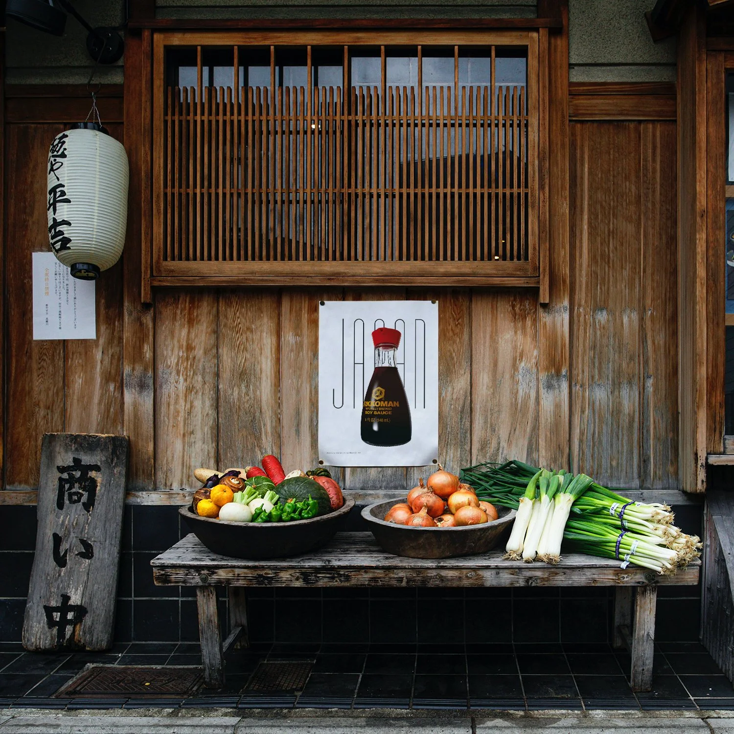
In a way the history of the Kikkoman Soy Sauce dispenser, designed in 1961, started at the end of WWII. Kenji Ekuan was born in Tokyo but spent his early years in Hawaii. At the end of the war his family moved to Hiroshima where his father worked as a Buddhist priest. At 16 Ekuan was just released from naval academy when the atomic bomb destroyed Hiroshima and he witnessed the devastation from the train taking him back home. He lost his sister in the blast and his father became Ill with radiation sickness and died a year later.
This tragedy lead him to rethink his career. Instead of following his father’s footsteps he decided he wanted to take part in reshaping post-war Japan through design.
In a later interview he told the New York Times “Faced with that nothingness, I felt a great nostalgia for human culture”. He continued “I needed something to touch, to look at”. “Right then, I decided to be a maker of things.”
In 1952, soon after graduating from the National University of Fine Arts and Music in Tokyo, Mr Ekuan founded his design studio G.K. Design. One of his early assignments came from Kikkoman who wanted him to create a soy sauce dispenser. Up til then soy sauce was bought in big glass bottles and poured into small ceramic dispensers. Due to the particularly high viscosity of soy sauce it, more often than not, dripped along the side of the dispenser leaving a stain on the table.
Kenji Ekuan chose to make a glass bottle so you would know exactly when to refill it, and when you did you wouldn’t spill thanks to its wide mouth. The bigger problem was how to make the cap.
This part of the project ended up taking 3 years. It had to be easy to pour but yet spill-proof. After 100 prototypes Ekuan realized that the best solution was an upward facing spout. The spout design made the last drop flow back into the bottle rather than dripping onto the table.
Released onto the international market in 1961 the Kikkoman soy sauce dispenser became a symbol of new contemporary Japanese design. Ekuan’s goal as a designer was to make design solutions for the masses and with the Kikkoman dispenser he managed to do just that with an exquisite example of Japanese design spread to kitchens all over the world.
Taking Prints to the Next Level
You might not have either space nor the economy to buy an Italian design classic like Achille and Pier Giacomo Castiglioni’s Arco floor lamp. You might not necessarily have any wall space to get a print from the Italy at Random collection either. But you probably have a sofa, a bed or a favorite chair. What makes that relaxing space even better, well, a double sided throw pillow of course.
You can now get the Random Things collection as a beautiful pillow to light up any space in your home or office, or vacation spot for that matter.
Picking Italian Mushrooms
Massimo Vignelli was born in Milan in 1931. At the age of 14 he decided he wanted to be an architect and at 16 he started working as an architectural draftsman before attending Università di Architettura in Venice. Here he met his future wife and business partner Lella Vignelli, herself coming from a family of architects.
In 1956 Massimo Vignelli was commissioned by the already famous glass maker Venini to design a series of lamps. The company had already worked with Italian designers like Carlo Scarpa and Giò Ponti. This project was initially called 4040 Zaffiro a name that was later changed to Fungo thanks to the lamps mushroom shape. The collaboration with Venini lasted for a couple of years and the result was an incredible number of lamps in a vast array of colors.
In 1965 Massimo and Lella co-founded Unimark International with five other partners including Bob Noorda, famous for his Pirelli-posters. Two years later they started a branch in New York. Unimark soon rose to fame through their corporate identities for, amongst others, American Airlines, Ford, Gillette and Knoll and it quickly became one of the biggest design firms in the world. Being on top didn’t last for that long though. In 1970 the Vignelli’s left the company to start their own business, Vignelli Associate.
The Vignelli’s eventually changed focus to product and furniture design and in 1978 they founded a new company, Vignelli Designs.
During their entire career the Massimo and Lella complemented each other with Massimo mainly focusing on 2D projects like the New York subway map and corporate identities for American Airlines while Lella worked more with their 3D projects.
They both lived by the motto “If you can design one thing, you can design everything” and in the case of Massimo and Lella Vignelli they really could.
Sending the Bat Signal
The multi-disciplinary Gae Aulenti was born in Palazzolo della Stella, close to Venice, in 1927. She studied architecture at Milan Polytechnic University and graduated in 1953 as one of only two female students in a class of 20.
After graduation she worked as a graphic designer at a magazine called Casabella Continuita before becoming a professor at the Venice School of Architecture in 1960 and later at the Milan School of Architecture.
Apart from her career as a graphic designer, professor and architect Aulenti also gained fame as a furniture designer. During the 1960s she produced a great variety of furniture gaining her a prize at the Milan Triennial.
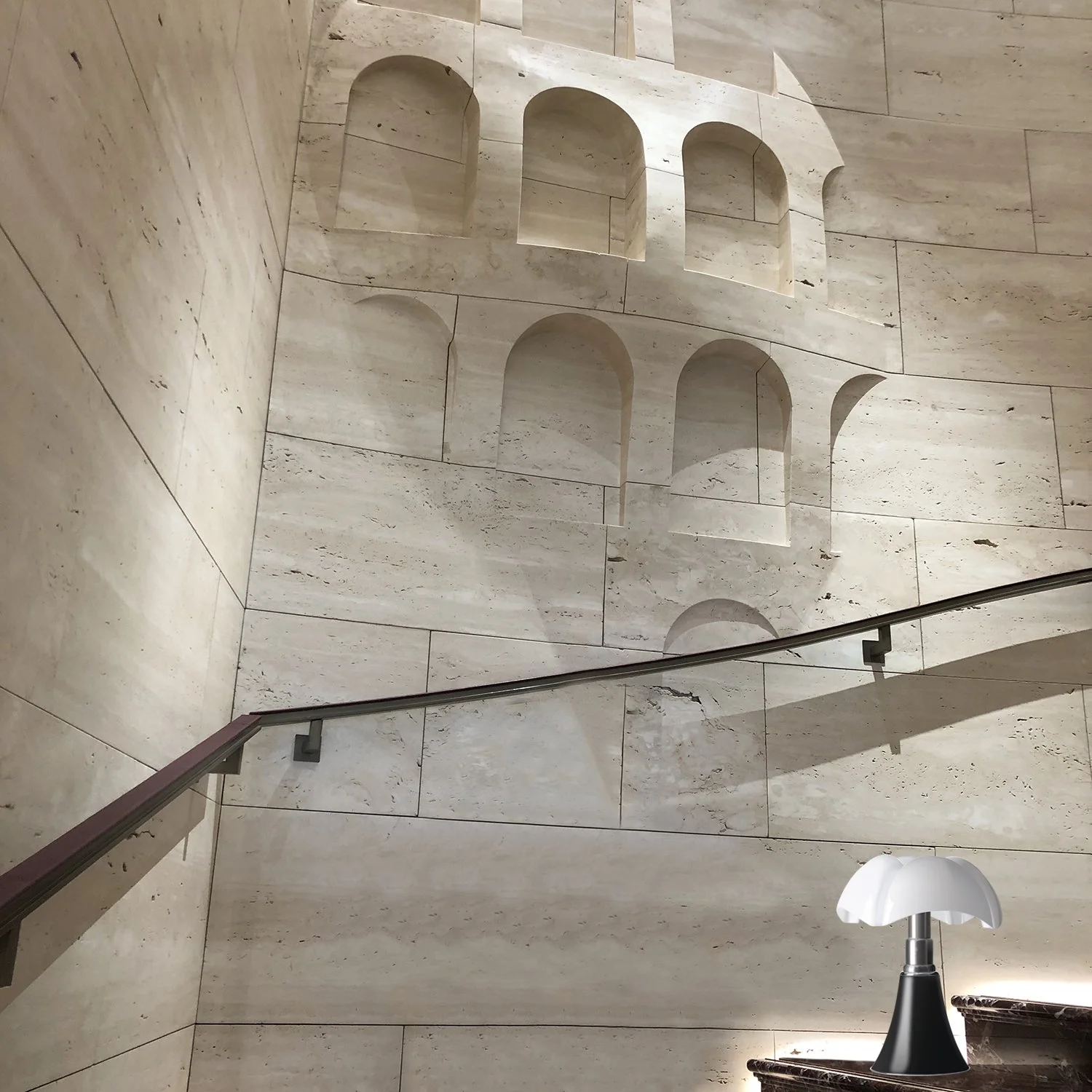
The Pipistrello lamp is essentially a very successful merge of two very different design elements. The streamlined telescopic base with the feel of American design and architecture from the 1930s and the lampshade made as a tribute to the natural forms of fauna and flora of the Art Nouveau movement.
Gae Aulenti designed the Pipistrello lamp in 1965 and went, sketches in hand, to Elio Martinelli who got famous in the 1950s for his innovative lamp-company Martinelli Luce. Seeing the sketches Martinelli immediately agreed to produce the lamp. Originally it was intended for the Olivetti store in Paris but it was such a success it was later put into production.
The smooth shape of the lampshade, looking like the wings of a bat, made Aulenti name it Pipistrello, meaning bat in Italian.
As an architect Gae Aulenti is probably most famous for the transformation in Paris of Gare d’Orsay to Musée d’Orsay. In 2012 she was honored when the Piazza Gae Aulenti was inaugurated in Milan’s most modern neighborhood.
Dubo, Dubon, Dubonnet
Dubonnet came into being in 1846 after a competition was held by the Frenchgovernment with a prize for anyone who could make a palatable quinine-rich drink. The French colonists in North Africa were suffering greatly from malaria and the only known cure was the incredibly bitter bark from the South American cinchona tree. The goal was to create a drink with enough of the quinine to help the French combat malaria but still be enjoyable enough to be used voluntarily.
Joseph Dubonnet created his Dubonnet by mixing Roussillon wines from five different grapes, blending them with herbs and spices like cocoa beans, colombo (a mild type of curry powder), orange peel, Colombian green coffee, cinnamon, camomille and elderflower. He then left it to mature in oak vats for three to four years.
One part of the success of Dubonnet is most certainly their marketing. In 1932 they hired the great designer and illustrator A. M. Cassandre who created the Dubonnet Man with a Bowler hat/Derby hat and a text reading Dubo, Dubon, Dubonnet.
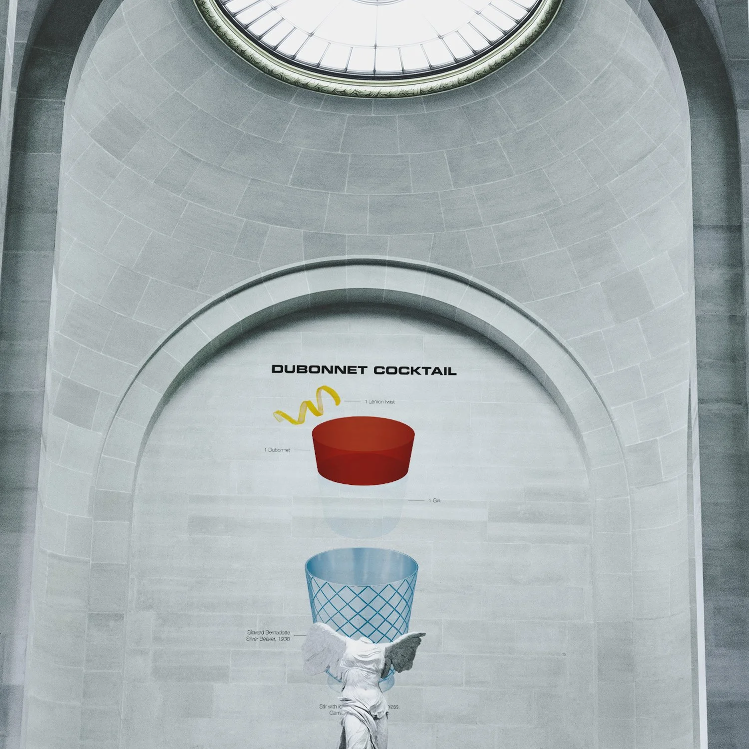
The Dubonnet Cocktail first appeared in print around 1914 in a book simply called Drinks by Jacques Straub but no one knows who first created it.
In Harry Craddock’s The Savoy Cocktail Book from 1930 the same cocktail appears under a different name, the Zaza Cocktail. The name Zaza was taken from a popular French play written by playwrights Pierre Berton and Charles Simon, and first staged at the Théâtre du Vaudeville in Paris in 1889. The play about a married man having an affair with an actress was translated into English and went on to become a huge success on Broadway and lent its name to a cocktail.
To complicate matters even further you can also find the same cocktail by the name The Queen’s Cocktail owing to the fact that it was the late Queen Elizabeth’s favorite cocktail. She is said to have had one every day before lunch, albeit made with two parts Dubonnetto one part gin instead of the original equal parts.
The silver beaker was designed in 1938 by the Swedish Prince Sigvard Bernadotte and is called Beaker 819B.
Too High End For a Low-Cost Competition
The lounge chair was designed by Charles and Ray Eames for the Museum of Modern Art’s competition “International Competition for Low-Cost Furniture Design” in New York in 1948. The competition challenged designers to develop cost effective furniture designs to be used in smaller houses in the postwar era. The guidelines stated that the works “fit the need of modern living, production and merchandizing”. MoMa ended up receiving over 3,000 submissions from all over the world.
The sculptural design of La Chaise was inspired by the ‘Floating Figure’ a work made by sculptor Gaston Lachaise who gave his name to this icon of modern design. You can actually find the original ‘Floating Figure’ at MoMa so Charles and Ray didn’t have to travel far to get their inspiration for the competition.
The La Chaise didn’t win the competition as it was considered too large but it did get a mention for its outstanding form. It was intended to be released by Herman Miller in 1950 but was considered too expensive to produce and was never manufactured. This might have been another reason it didn’t win. It was a competition for low-cos furniture after all.
It took another 40 years until Vitra put La Chaise into production in 1991, first in fiberglass as the original from 1948 but since 2001 Vitra uses polyurethane.
In the same MoMa competition the legendary Art Director of Harper’s Bazaar, Alexey Brodovitch competed with his Floor Chair (model 1211-C). It was a plywood rocking chair that was described as “exceptionally simple and comfortable” made with inexpensive materials and a basic construction. With his Floor Chair Mr. Brodovitch was awarded third prize.


